
Components
Table of Contents
Intro to Components
Components allow you to maintain a consistent, efficient, and scalable website by creating customizable blocks from elements and child elements. Reuse those blocks across your site, and modify them in a single place to avoid individually revising each recurring layout. Throughout this build components are used for Navbars, Footers, and specific sections or layouts like a CTA section. This page should get you up to speed on how to edit components and also includes a list of the components used in this site below. For a full guide on using components check out the Webflow University page.
How to Edit a Component
To make the same changes across all instances of a component, you’ll need to edit the main component. You can edit the main component on any component instance by:
- Double-clicking the component instance
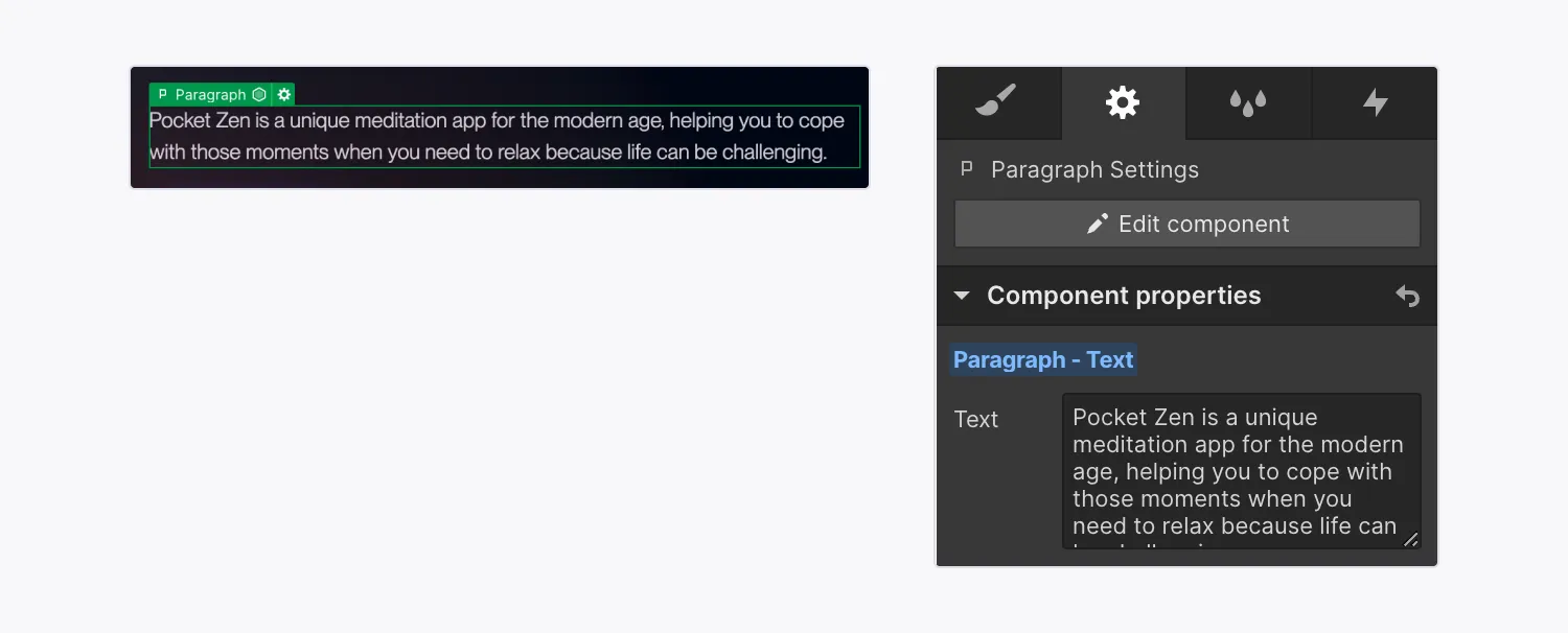
- Right-clicking the instance and choosing Edit component
- Selecting the instance and clicking the “pencil” icon in the label
- Selecting the instance and clicking the Edit component button in the Style, Element settings, or Interactions panels
- Selecting the instance and using the keyboard shortcut Enter
When you do this all other elements on the page will get a dark overlay to show that you are updating the main component and that any changes to it will affect all other instances of that component.
Understanding component properties
Component properties let you define specific elements within a component that can be modified with unique values on a component instance. For example you could make a CTA section that has an editable title and button. In more advanced use cases component properties can also show and hide specific elements, or even change visual styles (like button style, spacing amounts, or section color).
To edit a content property (eg a heading or image) you should:
- Locate the component instance that contains the element whose values you want to modify
- Select the element on the canvas
- Go to Element settings panel > Component properties
- Modify the element’s property values (e.g., update the text, replace an image, set the visibility, etc.)
Note: Some components (like a Navbar) might not have any properties set up because instead of having the component include different content on each page it needs to be consistent across the site without any parts of it changing.
Components and Variables
Some components on this site use variables and/or custom CSS to give you more design flexibility when using the component. A common use may be to have independent control over the top and bottom section padding. In these cases follow whatever the naming convention of the default property value is when applying styles to the component. For example if the default value is 2, try updating it to 0, 1, or 3 and see how the component responds. If the default value is 'false' the other option is probably 'true'. If you make a change to a property and see no visual change on the component just reset the value to the default property value.
Components in this site
The components used in this site are displayed below, feel free to copy and paste them onto new pages or modify them to familiarize yourself with each of their options. Note: The navbar is not included on this page but you can find it on almost any other page throughout the site.
Boka en städupplevelse idag!
Fräscha upp ditt utrymme med obefläckad renlighet! Boka vår städtjänst idag och njut av en miljö som utstrålar renlighet och komfort.

